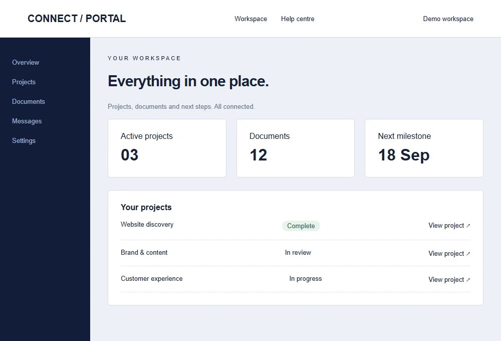

1. An unclear first message
Visitors should be able to understand what the business does without solving a puzzle. An abstract slogan may sound impressive but leave a potential customer unsure whether you offer the service they need. A clear heading and short explanation can do more work than a large decorative introduction.
Review the first screen with someone unfamiliar with the company. Ask them to describe the offer and the next step. If they cannot, revise the message before adjusting visual details. This is a practical usability check, not a promise that changing a headline alone will increase sales.
2. Navigation organised around the company chart
Internal department names do not always match customer expectations. Visitors generally look for a service, product, example or contact route. Navigation should help them find those things using familiar labels.
Keep important options visible and group related pages sensibly. On mobile, check that the menu opens reliably, fits the screen and can be closed with a keyboard. Avoid an overly deep hierarchy for a small site. If a customer must understand your internal structure before finding a service, the website is creating unnecessary work.
3. Contact actions that are hard to find
A visitor who is ready to enquire should not need to scroll through every section to discover how. Use a clear contact action in the navigation and at sensible points after service information. Explain whether the next step is a quotation request, booking enquiry or general message.
Check that labels match the destination. A button promising a quote should lead to an appropriate brief or clear quotation process. Do not imply instant pricing if the business needs to review requirements first. Consistent actions make the journey easier to understand without covering every section in competing buttons.
4. Forms that fail silently
A contact form can look polished while sending nothing. Test validation, loading, delivery and failure states. A success message should appear only after the system has actually accepted the enquiry according to its configured delivery process.
Give visitors a useful response when something goes wrong. Preserve their input so they do not need to retype it. Provide a real alternative contact method where available, or a way to save the brief. Clear labels and sensible field lengths also matter. Collect the information needed for the next step rather than turning a first enquiry into a lengthy application.
5. Small-screen layouts treated as an afterthought
A desktop design does not automatically become usable when squeezed into a phone. Watch for tiny text, clipped buttons, awkward tables and fixed elements that cover content. Check the website using the real copy, including long headings and validation messages.
Try the primary journey with one hand on a small screen. Can you open the menu, read the service information and complete the form without horizontal scrolling? Also test larger text settings and keyboard focus. Mobile responsiveness is an interaction question as much as a visual one.
6. Heavy media without a clear purpose
Large images, background videos and third-party scripts can make a website slow to become useful. The issue is not that imagery is bad; it is whether each asset earns its cost and is delivered appropriately.
Use suitable image dimensions and modern formats, reserve space to prevent layout shifts and load below-the-fold media when needed. Prioritise the main visible image without eagerly loading every asset. Check performance after adding chat, analytics or marketing tools, because integrations can change the experience. Measure representative pages and investigate actual bottlenecks rather than chasing a score through arbitrary changes.
7. Unsupported trust claims
Invented testimonials, unexplained badges and unverified results can undermine credibility. Use real evidence with permission and explain the business context. A project screenshot is more useful when visitors know what work was completed.
If the company is new, demonstrate clarity through the process, services and quality of communication. Design concepts can illustrate capability when they are explicitly labelled as concepts. Do not present them as completed client work. Honest, specific information creates a stronger basis for an enquiry than a collection of impressive claims the business cannot substantiate.
8. Every page targeting the same search phrase
Repeating a location keyword on every heading does not make the website more useful. Different services deserve pages that answer their own customer questions. A visitor considering ecommerce needs different information from someone replacing a small company website.
Plan content around those intentions and link related pages naturally. Explain relevant geographical coverage without generating near-identical pages for every suburb. Use descriptive page titles and readable copy. Search-friendly structure should clarify the business for customers and search systems together. It should not turn ordinary paragraphs into a list of keyword variations.
9. Redesigning without preserving useful history
A redesign can accidentally remove pages, change URLs or hide valuable content. Before rebuilding, inventory the existing website and identify pages that support real customer journeys or receive relevant traffic. Decide what will remain, move or be consolidated.
Create a redirect plan for important changed addresses and test it after launch. Check internal links and indexing settings as well. A new visual design should be accompanied by a deliberate migration process. Keeping every old page is not always appropriate, but removing content without understanding its role introduces avoidable uncertainty.
10. No owner after launch
Websites become unreliable when nobody owns routine checks and updates. Contact details change, staff leave, services evolve and software requires attention. A maintenance agreement can help, but the business still needs someone responsible for approving content and reporting problems.
Assign owners for domain renewal, hosting, updates, backups and enquiry delivery. Keep access information secure and document the support route. Review a small set of important journeys regularly rather than waiting for a customer to report a failure. A useful website is maintained as part of the business, not treated as a completed poster.
Choose the next improvement with evidence
Do not assume all ten issues affect your website equally. Start by testing the main customer journey and reviewing genuine enquiries, support questions and appropriately collected analytics. Fix broken functionality and confusing information before investing in cosmetic changes.
Write down the problem, the proposed change and how you will assess it. This keeps improvement work focused. Our website design and development services can help review an existing site, prioritise the changes and plan a redesign when one is justified. The aim is a clearer, more dependable experience that helps the right customers take the next step.
Plan your next website
Explore our website design services, learn about custom web development, or send us your brief for a recommendation.